beccateve sti du' volantini :
Nuovo Logo
-
Ginofelino

- Posts: 141
- Joined: 09/02/2012, 1:04
- Contact:
Re: Nuovo Logo
Ao' so vivo .. ho dovuto fa un ecommmerce e un paio di volantini .. mo ho quasi finito e torno operativo settimana prossima 
beccateve sti du' volantini :
beccateve sti du' volantini :
- Attachments
-
- tennis_lazio_cell.jpg (202.83 KiB) Viewed 3531 times
-
- calcio_lazio_cell.jpg (215.54 KiB) Viewed 3531 times
Heroes Never Die

Re: Nuovo Logo
Bella GI' , sei un professiosta 

-
Ginofelino
- Posts: 141
- Joined: 09/02/2012, 1:04
- Contact:
Re: Nuovo Logo
Ho fatto sta variante ..
- Attachments
-
- logo333.jpg (49.98 KiB) Viewed 3442 times
Heroes Never Die

Re: Nuovo Logo
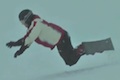
In quest'ultimo logo, visto che non si vede la tavola, sembra che Mario stia prendendo uno scivolone con gli scarponi 
Tipologia rider: Fenomeno da bar..

Re: Nuovo Logo
Io penso che sia meglio l altra foto quella in back che è stata pubblicata su carving mag
le foto prese da fotogrammi della go pro messa sulla tavola sono troppo ravvicinate.
le foto prese da fotogrammi della go pro messa sulla tavola sono troppo ravvicinate.
You take the red pill-you stay in Wonderland,I show you how deep the rabbit-hole goes.
https://www.carvers.it
https://www.carvers.it
-
remocarving

- Posts: 591
- Joined: 13/02/2012, 19:31
Re: Nuovo Logo
quello che nn piace a gino (il primo della pagina precedente) secondo me e' il piu' aggressivo e di conseguenza il piu' belloGinofelino wrote:non mi fa impazzire .. meglio loghetto e scritta .. bho mo continuo..
oxess race titanal 164 - f2 speedster rs 173 - f2 speedster rs 183 - sg fullcarve 180
Re: Nuovo Logo
Aaaaaaaa, certo un po' più elaborato ma il logo in fondo alla pagina non vi ricorda niente?
- Attachments
-
- upz.jpg (110.58 KiB) Viewed 3205 times
You take the red pill-you stay in Wonderland,I show you how deep the rabbit-hole goes.
https://www.carvers.it
https://www.carvers.it
Re: Nuovo Logo
Quello giallo??? 
Re: Nuovo Logo
Beh dai... la fantasia non è molta.
Se metti uno che carva, o lo metti in front oppure in back
Ci sarebbe eventualmente il saltino al cambio lamina
...
...
...
...
...
...
...
...
...
...
...
...
...
...
...
...
...
...
...
...
...
...
...
...
...
Se metti uno che carva, o lo metti in front oppure in back
Ci sarebbe eventualmente il saltino al cambio lamina
...
...
...
...
...
...
...
...
...
...
...
...
...
...
...
...
...
...
...
...
...
...
...
...
...